Research case study
Making it easier for Kirppu sellers to book a stand, list items, and get them into the showroom
Outcome
Kirppu needed sellers to book longer stands, list items online, and keep those items visible. The old path left that to chance. We redesigned booking to put the 2-week deal in front, turned online listing on by default, rebuilt item management around the actions sellers and staff actually need, and shipped Showroom so items on stands can be browsed.
Bringing Denmark's largest flea supermarket chain online, for sellers and shoppers alike.
Research brief
- WHO
- Kirppu — MyKirppu, Showroom, and stand booking
- WHAT
- UX design for stand booking, item management, and Showroom browsing
- RESULT
- Redesigned the core flows to engage users to pick desired business options while booking a stand, created the new Showroom feature and updated the screen for managing items.
Project summary
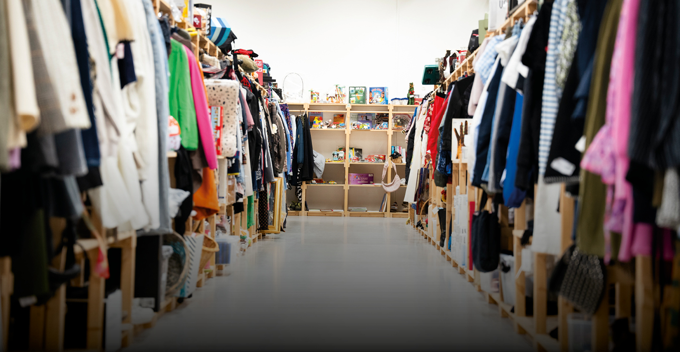
I redesigned Kirppu’s item management, sales, and booking experience, and created a new feature called the Showroom. An online platform that lets customers view items sold at local stands within the Kirppu ecosystem. The goal was to make the existing flows clearer and more efficient while introducing a new way for customers to discover items.
Problem statement
Kirppu needed a redesign of their existing item management, sales, and booking flows, as well as a new Showroom feature. Stakeholders highlighted that MyKirppu is used by both staff and customers of all ages, with special attention needed for older users. They also stressed that the Showroom was crucial, and that the booking flow should help users choose stands that generate revenue for the business while still delivering value to the renters.
User and needs
Kirppu is Denmark’s largest chain of indoor flea markets, where people rent stands to sell second-hand items and customers come to buy them. MyKirppu is used by both stand holders and Kirppu staff. The goal of the project was to optimize the UX for MyKirppu, the booking flow, and the new Showroom experience, while keeping the design simple and accessible for users of all ages.
My role in the project
I joined Kirppu as a UX designer. I worked closely with the CTO on the requirements for the new Showroom and collaborated with a developer to ensure the designs were feasible. To support development, I created a design system and detailed documentation. I also worked with the marketing manager to gather user insights (as there were no resources for formal research) and with the brand/graphic designer to align on colors, fonts, and brand guidelines.
The mandate
Push the 2-week deal, fix item management, and launch Showroom
Kirppu wanted the booking flow changed so sellers land on the 2-week stand deal they promote. That’s the commercial goal. The same work had to give sellers every action they need to run their items, and ship a new Showroom so people can browse what’s on the stands.
Item management
Kirppu already gives sellers a lot of ways to manage items. The real problem was not adding more. It was knowing which actions actually mattered, because dumping everything on screen would bury people in choices.
We could not talk to users. So we worked from what we had: current product data, plus competitors like Vinted and DBA.
After several team meetings, we locked the item actions that mattered most to staff and to sellers. Not every possible control. These:
- Select items
- Add an item
- Filter items
- Mark an item in-store or out — that puts it on a stand in Showroom, or takes it off
- Preview how the item will look in Showroom
- Delete
- Order labels
- Edit
Bulk actions had to be simple. The other piece of item management was acting on more than one item at a time. Sellers can turn selection on, pick the items they want, and run the same action across that set — or grab several items in one go and work from there.
No extra steps — especially on mobile. The point of this setup was to put the actions sellers need in reach, without sending them through extra screens. Staff are expected to work on desktop. Sellers are on their phones. That mobile path had to stay short, so managing their own items does not fall apart in the store or at home.
Booking flow
The 2-week deal had to sell itself. This part mattered to the business. Stakeholders wanted the two-week deal in front of sellers in a way that made Kirppu more money — and still read as a benefit to the person booking the stand, not as a shove.
What we've aligned on is to make a card visually appealing so it grabs the users attention. Within the card we have wrote the benefits of picking the option. With this approach we have ensured that visually it's more prominent, making it clear what benefits this option carries.
The deal had to win the glance. We aligned on a card that pulls the eye first. The benefits of the two-week option sit on that card, so sellers see why it’s worth picking before they start comparing the rest. Stronger visually. Clearer on what they get.
Once sellers picked their rental period, the next business push was getting those items listed online. Stakeholders saw another opening there. Same rule as the two-week deal: it had to make Kirppu money, and it had to tell the seller why listing online is worth doing — clearly enough that they actually do it.
After the rental period is chosen, online listing is on by default. Sellers can still turn it off. If they do, they get a warning that spells out what they lose. The point is to keep it on — without hiding the choice. Keeping it enabled as default was a non-negotiable.
Showroom
Showroom was new, and we had four weeks to ship it. The job was simple on paper: let people look at items from different stands. Stakeholders also wanted the category picker to work the way Vinted’s does.
What I learned from this project
You can ship without research. You cannot pretend that is free.
We had no user sessions. The work ran on current product data, competitor patterns from Vinted and DBA, and a lot of alignment meetings. That got us to a decision. It also meant we were guessing which item actions actually mattered, and guessing is a business risk when the whole product already has too many options.
Business goals need a visible user benefit, or people bounce.
The 2-week deal and the “list it online” prompt were commercial asks. The lesson was not “hide the upsell.” It was: put the benefit on the thing they are looking at. The deal card had to win the glance. Online listing had to start on, with a warning that says what they lose if they turn it off. Stakeholders get the conversion path. Sellers get a reason.
Defaults do more work than extra screens.
Turning online listing on after the rental period, then warning on deselect, moved more people than another explainer page would have. Same idea as making the 2-week card the loudest option. You steer with hierarchy and defaults first.